The design and implementation of a landing page – or pages! – is not a game for the uninitiated nor the inexperienced. Even talented amateurs must bow their heads to the “tried and true” methods of the professionals. Here are a few tips from the pros to improve your efforts:
1. Minimize Loading Time
Internet users – especially the mobile ones – get more impatient every year. If your landing page takes more than a second or two to load, they will often move on to other – faster loading – pastures. Additionally, the speed of loading also correlates well with how the user responds to the information. In other words, a slow loading website not only loses users before it opens but also afterward.
2. Make Navigation Easy
A poorly laid-out landing page and its associated website that are not intuitively easy to navigate will simply turn users off. If they can’t find what they want in a click or two, they will leave your site sooner than you can say, ”Google.” Also, be sure to use multiple landing pages to guide your visitors to the most useful info as quickly as possible.
3. Simplify the Copy
Think Ernest Hemingway not William Safire. In other words, keep the copy simple and to the point. Use short sentences. Analogies and allusions are great when writing fiction but visitors to your site want information imparted as quickly and as memorable as possible. Avoid jargon, break up large paragraphs and use bullet points where applicable.
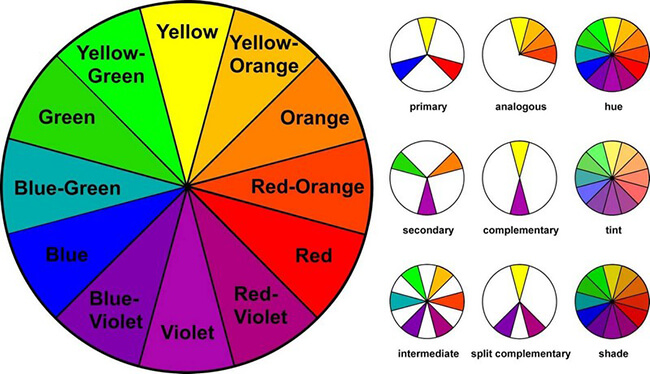
4. Utilize Contrasting Colors
To some extent, we have argued against this very tip earlier in the article. Still, used judiciously, contrasting colors can lead the viewer’s eyes to the most important information on a page. Don’t do it on every page or it loses its effect. The call-to-action, however, is an ideal spot to utilize this technique. Use a color wheel to map contrasting colors for call-to-action buttons.
5. Experiment with Different Fonts
Similarly, be focused in your use of fonts. A ragtag mixture is a sure sign of an amateur approach. It is far better to use variants – bold, italics, etc – within a font family than to include a completely extraneous one.
6. Don’t Forget Compelling Images
As the man said along time ago, “A picture is worth a thousand words” and with the Internet being so visually oriented, the saying is now probably an understatement. In other words, professionally done photographs of your product or high-grade graphics can mean all the difference between a middling and a superior website.
7. Optimize for Those on the Go
Whether you realize it or not, the newest generation of Internet users requires your site to be compatible with their slew of indispensable mobile devices… or they will just go somewhere else. From phones to tablets and beyond, you must regularly check your site for compatibility with the latest and greatest devices to come onto the market. Users rank non-compatibility as one of their biggest turn-offs about websites.
8. Create an intuitive CTA
Regardless of what your call to action is – download a white paper, watch a demo video or sign up for a free trial – you must make it as painfully obvious as possible for your visitor or it will usually be overlooked or ignored.
For more information on superior landing page design, please contact us at Touchline Marketing. We can be reached at https://touchlinemarketing.com.
